
In this post, we’re going to do a tear down of the Stripe’s knowledge base. Stripe’s knowledge base has been a key factor in their growth to an estimated revenue of $540M and 1,000 employees.
Launched by two brothers, Patrick and John Collison, it was their answer to weighty, expensive and complicated payment processing platforms like eBay, PayPal and Google Checkout.
Their product plugged a gap in the market between self-hosted payment processing and branded third-party processors. Stripe focused on enabling businesses to own the payment experience – without having brands like Google or PayPal also sneakily marketing to their customers.
Before Stripe, no product out there allowed companies to easily and quickly process payments themselves. There were certainly no products that were easy to use for developers. And as much as developers may sometimes hate writing documentation, they always love using good docs.
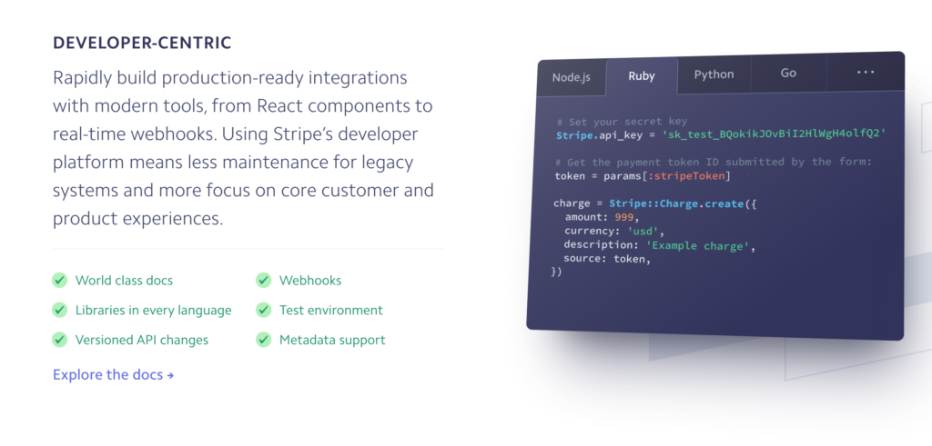
Stripe shows how much it values developers by featuring its docs on the homepage and using the term ‘developer-centric’. Valuing developers is a huge part of what wins Stripe so much recognition in developer circles.
Stripe homepage
“Most new products suffer from a lack of documentation. It’s often an afterthought and rarely considered as a marketing opportunity. Yet for developer-focused products, documentation is one of the most critical assets that you can create.” Growth Hackers
Stripe’s documentation is core to its growth as a company. It’s well-known for its outstanding knowledge base and exemplifies the use of many knowledge base best practices. But what do developers love so much about the Stripe docs?
Let’s go straight into the Stripe knowledge base and find out what’s good and bad about it.
Stripe Knowledge Base Homepage
Stripe organises its homepage by highlighting individual products – but also focusing on how users will interact with their software. Instead of using product jargon, they clearly explain each section.
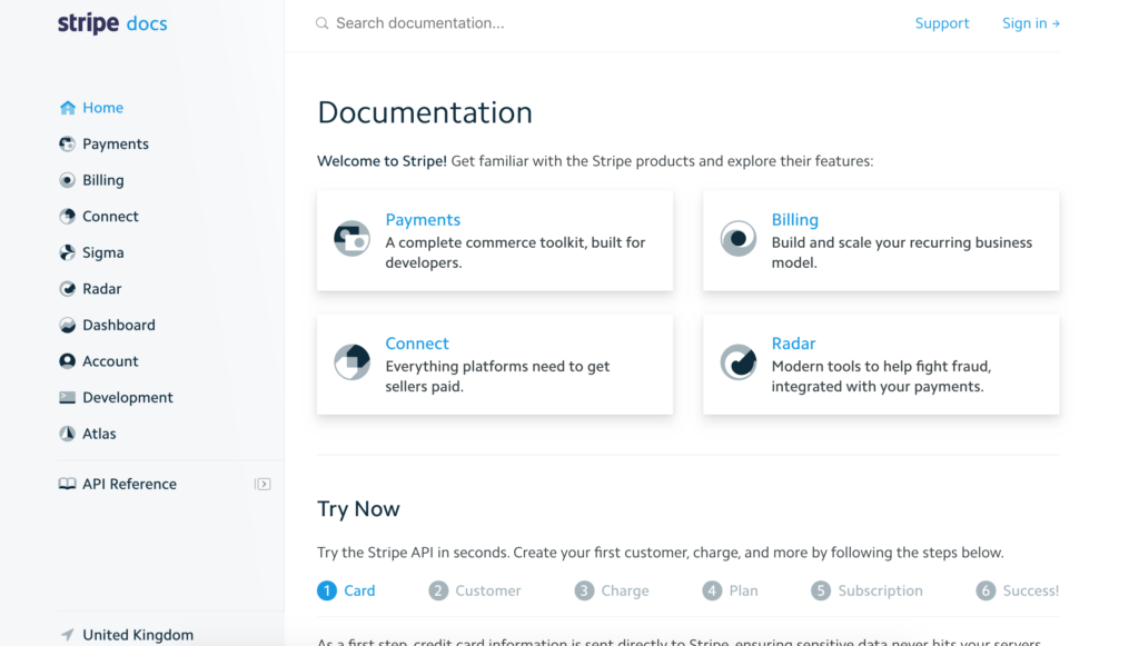
Stripe’s knowledge base homepage
They totally avoid branding or spin and just name the products by what their purpose is. Once you click through to each category, the product is often named. This means you don’t have to be familiar with Stripe’s terminology to understand its docs.
Discover a better way of software product documentation
Start free trial
The shading beneath the four main cards subtly indicates that there is more information to be discovered by clicking on them.
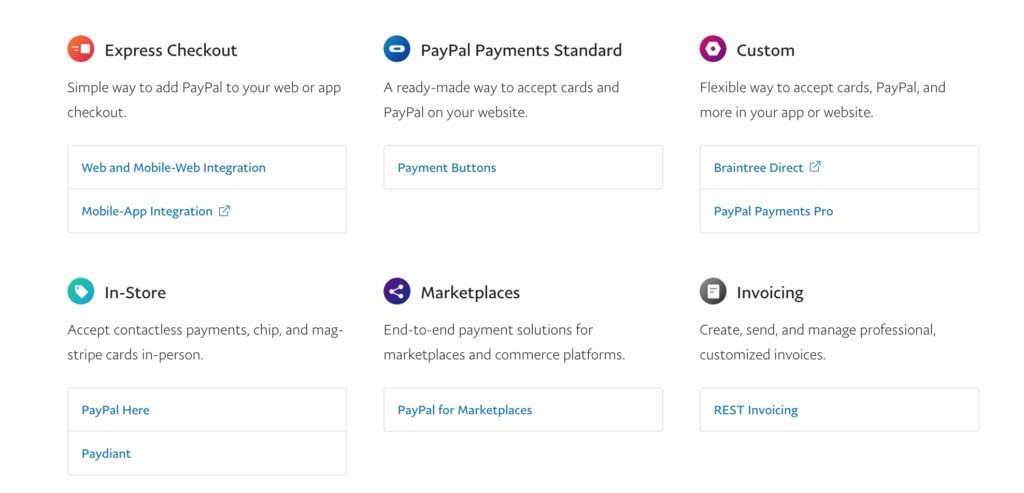
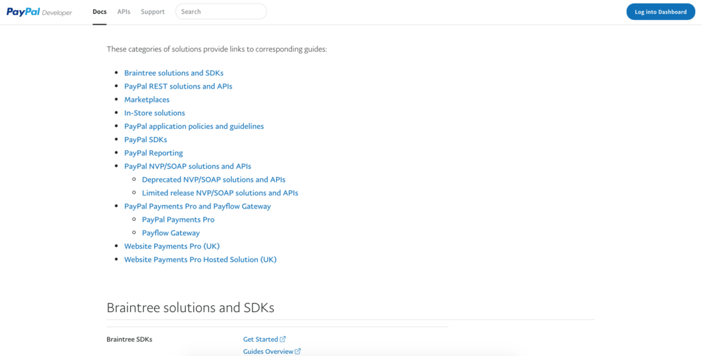
Compare this to the PayPal knowledge base, which uses language that probably makes more sense to internal employees than external developers.
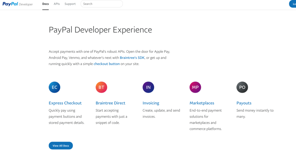
PayPal developer docs homepage
Paypal knowledge base includes sentences like ‘Open the door for Apple Pay, Android Pay, Venmo, and whatever’s next with Braintree’s SDK, or get up and running quickly with a simple checkout button on your site.’ It assumes a lot of prior knowledge up-front and is heavy on the brand names. Plain English would have fit their purpose better.
Stripe has an awareness that non-developers are going to be using their docs too (especially the homepage) and Stripe needs to get their buy-in. It provides an option for users who aren’t strictly able to benefit from their docs and this shows how Stripe is welcoming to users from all backgrounds.
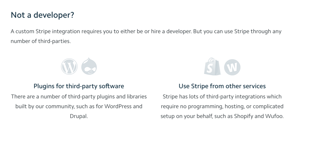
Information for non-developers
In a clever marketing twist disguised as User Experience, Stripe allows developers to make test API calls right from the documentation, thereby taking Stripe for a trial spin.
The fancy progress bar shows that Stripe has really invested in their UX and also hints at what the Stripe interface would be like to use.
Visual design and layout
Stripe’s overall visual brand is gripping and unique – not what you’d expect from a payments processing software company. Their strong emphasis on design shows that Stripe cares about User Experience.
You can immediately guess that Stripe is probably SaaS due to their prominent call-to-action above the fold, emphasis on visual design, product imagery and conversion copywriting techniques.
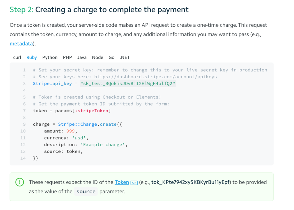
The knowledge base is on brand with the main website but Stripe has gone for a plain and more utilitarian look. The blue and white colour palette keeps the interface calm and where they do highlight important information, they pick a subtle green.
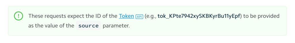
Stripe warning for creating a charge
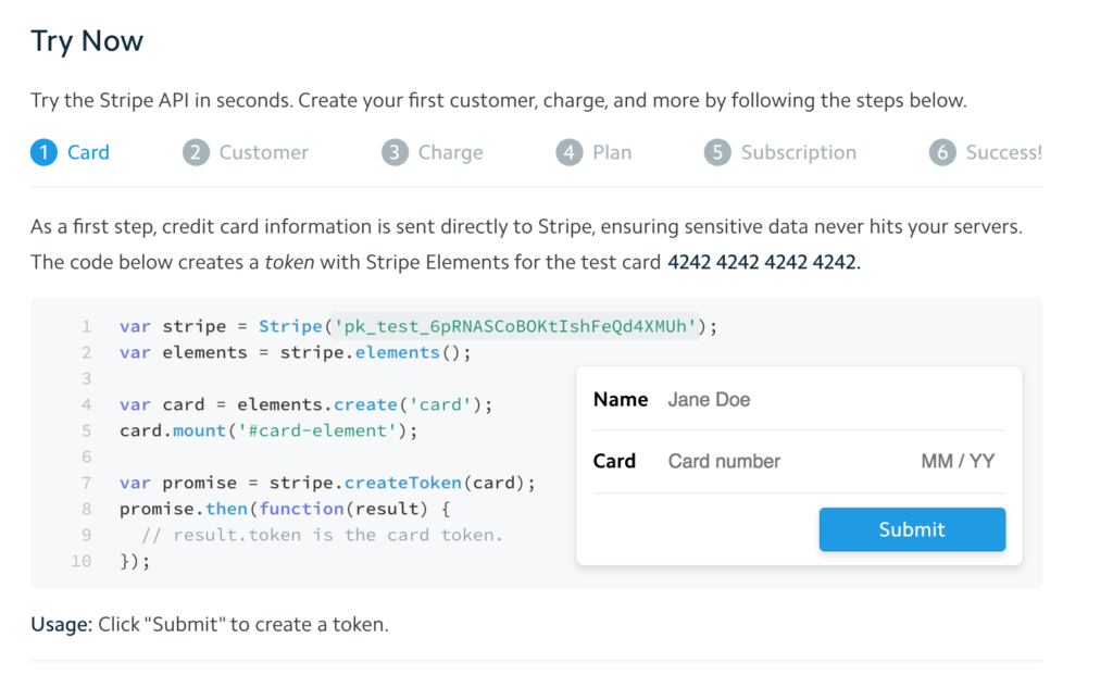
Throughout their entire Stripe knowledge base, it includes custom elements that help users try out the product without ever leaving the docs.
Card Element Quickstart documentation
This interactive widget allows users to create a payment form by actually submitting dummy data and seeing what happens. Being able to toggle between the different coding languages (HTML, CSS and JavaScript) brings the software to life for a developer in a way that just describing the software could not.
Brand voice
Stripe has cleverly kept a 100% neutral brand voice in its documentation. You don’t want branding and marketing speak slipping through in developer documents because that would destroy clarity and erode trust.
Stripe wisely ditches the marketing speak and you can easily understand what the company is trying to communicate.
Simple, effective and ready to implement knowledge base for your business
Try nowFor example, check out their ‘Card payments quickstart’. You do not need any prior knowledge of payment processing software or development skills to understand this page.
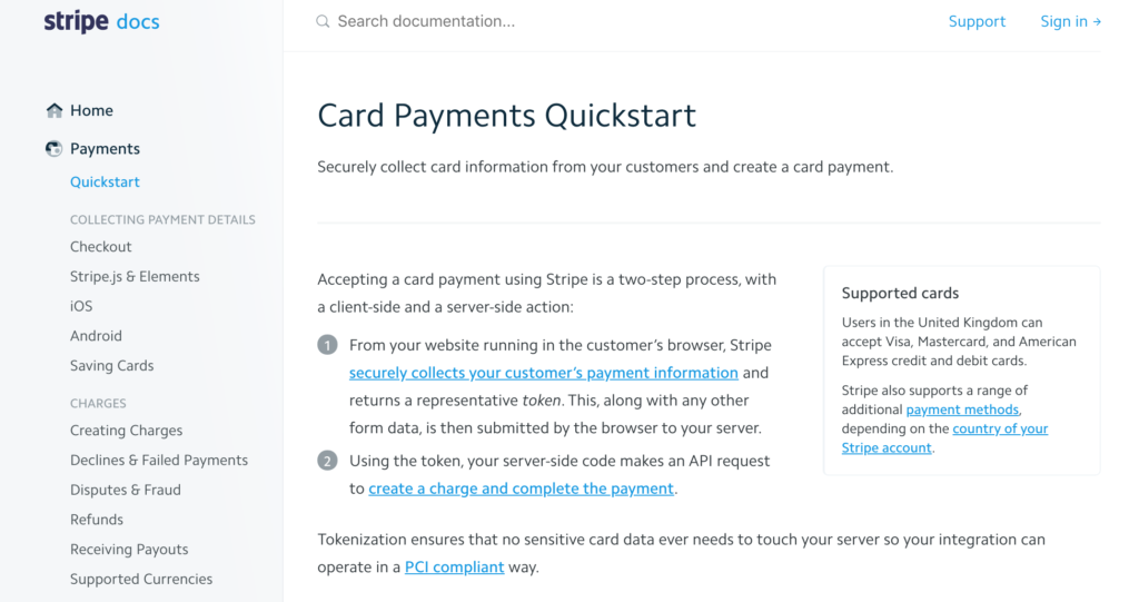
Card Payments Quickstart documentation
Just take this line: “Securely collect card information from your customers and create a card payment.” It focuses on what the user wants to accomplish rather than immediately weighing in with the tools to get them there. For any specific terms they use, they include a link to more information.
In contrast, the eBay developer documentation is full of marketing buzzwords. eBay wrongly assumes its users know exactly what is going on as soon as they hit the knowledge base software. Like with many other developer docs out there, there is no learning curve.
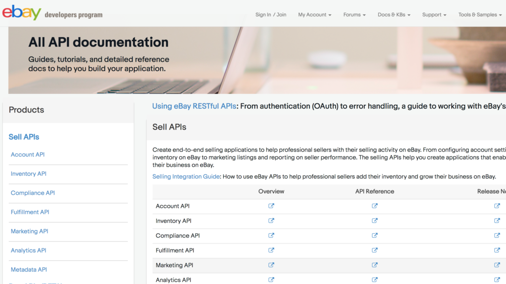
eBay developer homepage
It’s far better to do what Stripe does and translate your documentation language into plain English before you publish it. You’ll get no points for sounding like a corporate robot and your docs will be less effective.
Use of imagery
Stripe is strong on its use of code snippets for its developer audience. Stripe has developed its own knowledge base solution in-house which allows the user to click on different coding languages, thus altering the code examples for the entire page.
Example of a Stripe code snippet
By using colour to break up the information, Stripe emulates common coding tools like text editors. Code is far easier to read and understand when syntax is highlighted. This simple feature shows that Stripe is a company of developers making documentation for other developers.
This ease of usability has contributed to the developer advocacy that has powered Stripe’s exponential growth since its launch in 2011.
Again, custom icons also break up the monotony of text and subtly reinforce the Stripe brand.
Stripe custom icons
Other than their icons and code snippets, Stripe keeps it very simple. You don’t want too much imagery cluttering up your knowledge base.
Information Architecture/Navigation
Stripe’s knowledge base couldn’t be easier to navigate.
Information Architecture has an important bearing on how easy your knowledge base is to navigate for users. This is based on the principle of simplifying complex information by shaping information into familiar schemas.
There is a certain way that users expect websites to work, especially experienced users. They constantly take mental shortcuts which have led to the infamous scanning and impatience of web users. To deal with information overload, users make assumptions about how they expect the website to work.
Stripe starts with its simple left-hand menu which lays out all the top-level categories. These simple options belie the complex array of options hidden in the sub-menus. If Stripe presented these all at once, users would immediately be overloaded.
Instead, by stratifying information, users are able to see an overview of all the possible areas they could explore within the company knowledge base. This is better than the usual over-reliance on search, while though important relies too much on users knowing what they want to search for in advance.
The menu remains anchored to the page the whole time, giving users a base from which to hunt through documentation. Compare this to their major competitor PayPal, which starts off with ‘featured’ docs (what PayPal wants you to see).
PayPal knowledge base homepage
You have to opt for ‘All docs’ to uncover the full suite of categories and articles.
PayPal knowledge base categories
You decide what you want to look at, and then when you click through to a section the navigation changes and the user is no longer oriented.
Pro tip:
Findability
Can customers find Stripe knowledge base content when they are in the midst of a problem? Stressed developers under pressure from clients or bosses may not always look in the obvious places.
Stripe’s search bar auto-suggests articles that match a partial search or could be a misspelling.
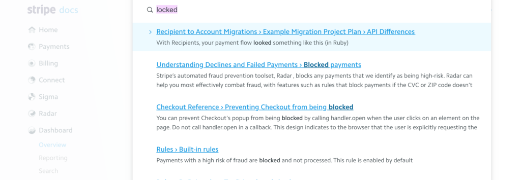
Stripe knowledge base search engine
Their search engine would be even better if it could suggest related articles. At the moment, the left-hand navigation can be expanded to reveal subcategories so this will help users in the event they get stuck.
User Experience
Stripe splits their docs between developers and potential customers. Since SaaS is often integrated with other products, this can be a crucial area to differentiate.
Developers have different expectations compared to other types of users. For one, they expect your docs to be direct – they will not appreciate the informal tone many companies use in their end-user docs.
Stripe recognises that the potential customers of their software are likely also to represent different business functions than your typical developer. The docs need to appeal to SaaS founders who may or may not have engineering backgrounds. This is a difficult line to walk successfully, but in doing so Stripe has produced consistently outstanding docs.
Implement a knowledge base system today and reduce your customer support cost by 67%
Signup now“Stripe’s documentation is so clear and well-written that it’s relatively easy for developers and non-developers alike to understand the API and associated products that come with Stripe.” Growth Hackers
Even though developers have often been forced to develop the ability to decode difficult information, they appreciate simplicity just like anyone else. Stripe demonstrate that they know their audience, in creating docs that allow highly technical users to quickly accomplish their goals with the software.
As we mentioned earlier, non-developers will also have an easier time using Stripe’s docs when compared to other API documentation. Growth managers or product managers may often have broad knowledge of technologies but lack the sufficient detail to understand jargon-heavy docs.
Top take-away tips
It’s probably safe to say that Stripe’s docs were not only created by engineers and long-suffering technical writers – there is a whole team behind the production. From graphic designers, to UX designers, to copywriters and customer support agents, Stripe docs provide a completely unified experience. It’s clear that the Stripe developers don’t work in silos.
The quality of Stripe’s docs promotes the company brand and forms part of its marketing strategy.
To follow the Stripe example:
- Put your users first
- Focus on simplicity
- Target one task per page
- Provide an anchor
- Encourage teamwork
- Use plain language
- Link to further information
- Invest in the visual design
- Let your docs show off your product
Stripe docs are simple and outcome-focused, while at the same time attractive to new users. The knowledge base provides significant value to the business while also making the product easier to use. It’s a win-win.
Document360 is the best knowledge base software that will have you well on your way to creating an outstanding knowledge base like Stripe’s. Sign up for the free trial.